NORTH CAROLINA · USA
Selland — Brand Book
A team brand-book effort centred on communicating reliability, technical competence and creativity through a coherent visual language.
Visual identity
A coherent visual language
- branding
- iconography
- visual strategy
01
Main Challenge
Selland needed a visual identity that communicated three qualities at once: reliability, technical competence and creativity.
The brand book was produced as a team effort. My contribution focused on the visual system — logo application, colour, typographic scale, photography direction and a custom icon set — so the brand reads consistently across every surface.
02
Brand book
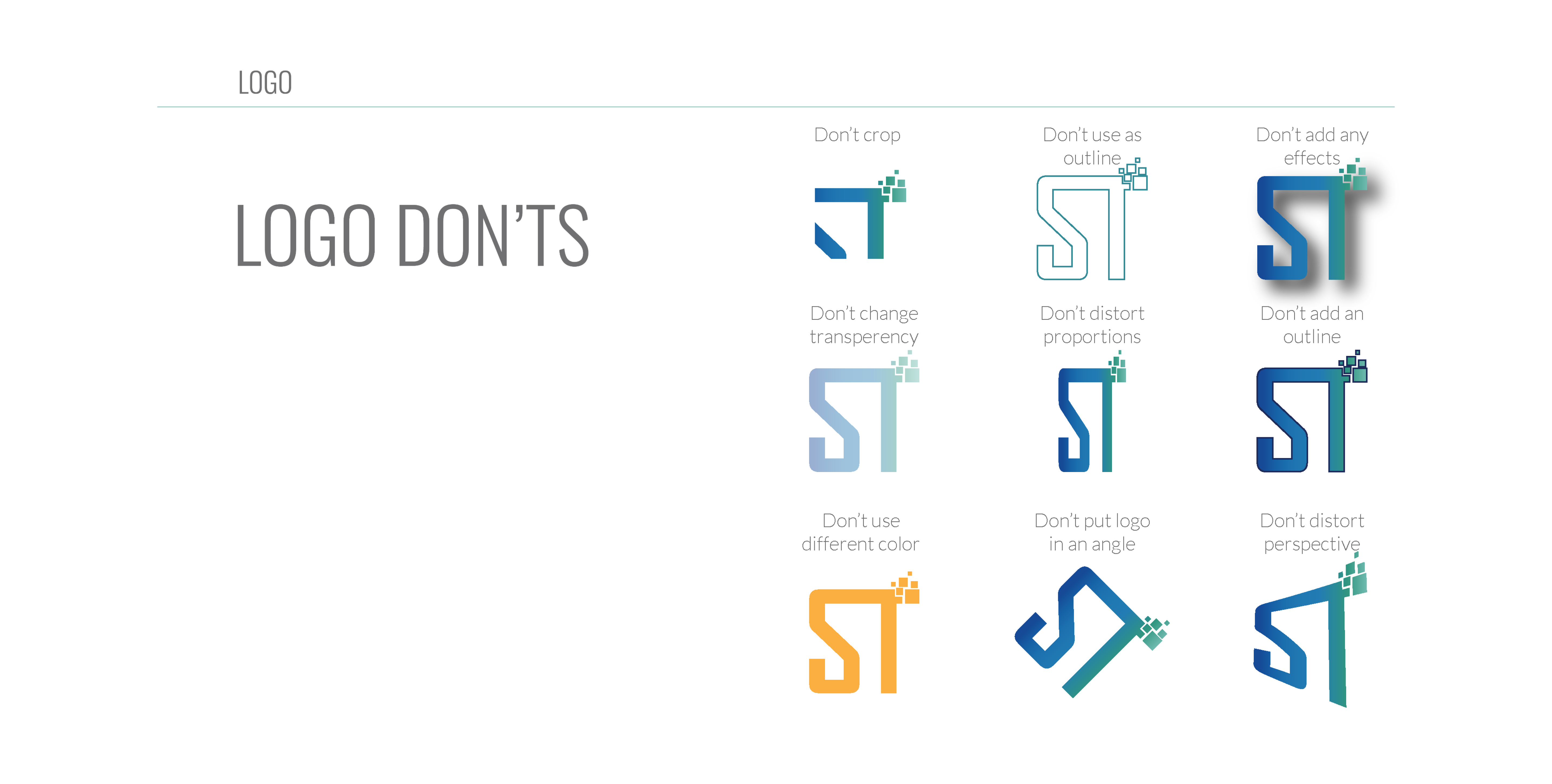
- LOGO
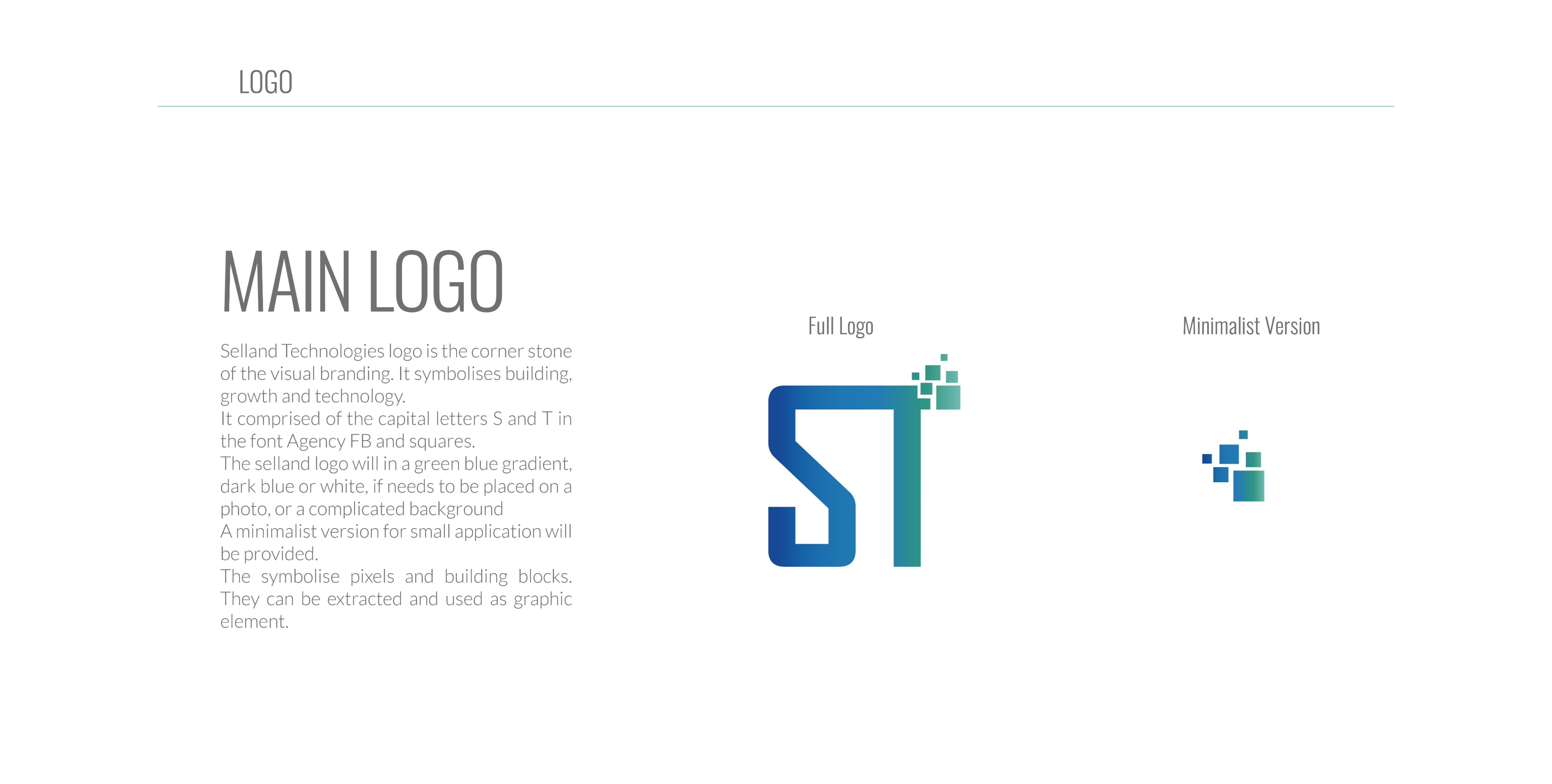
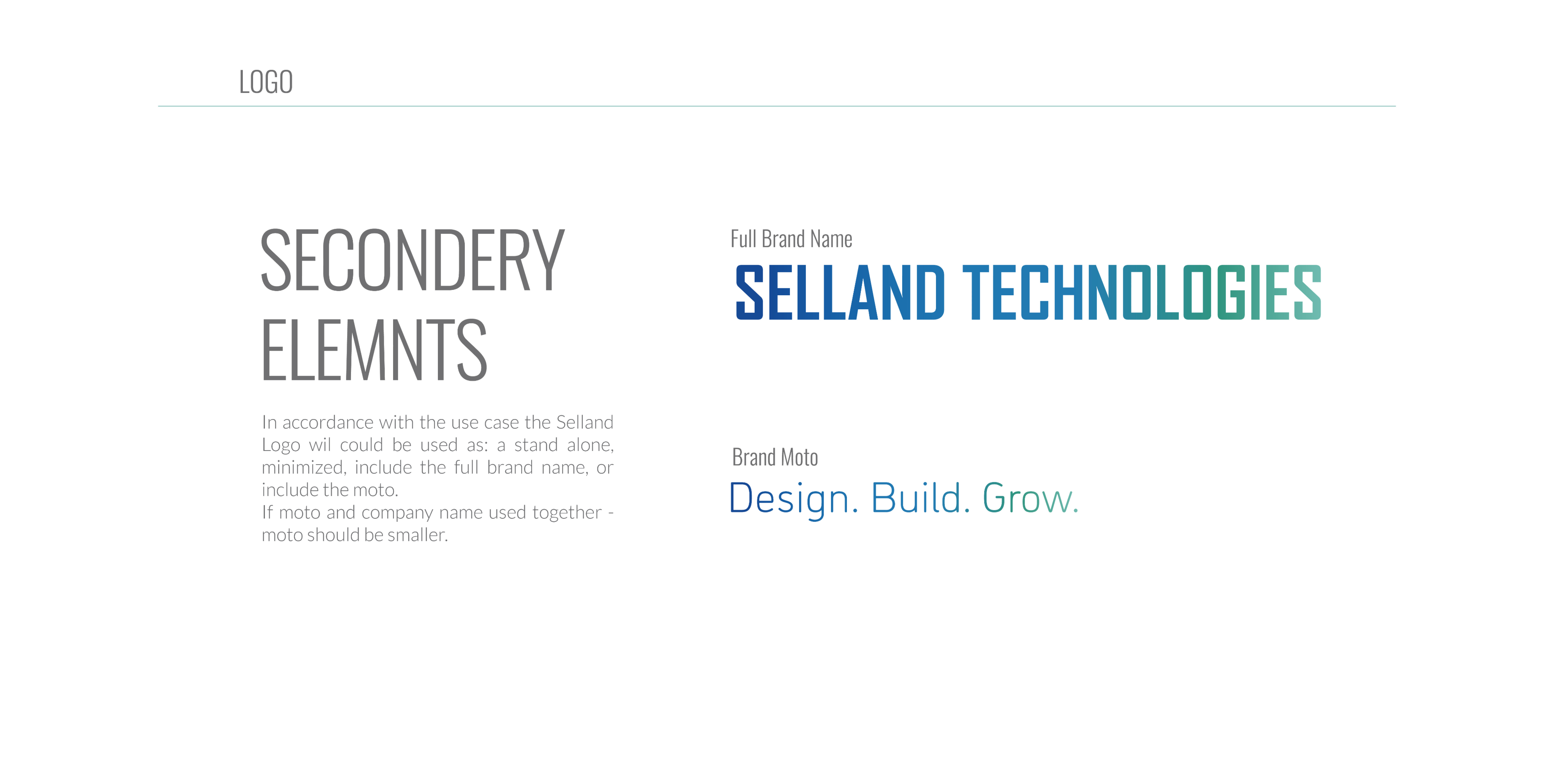
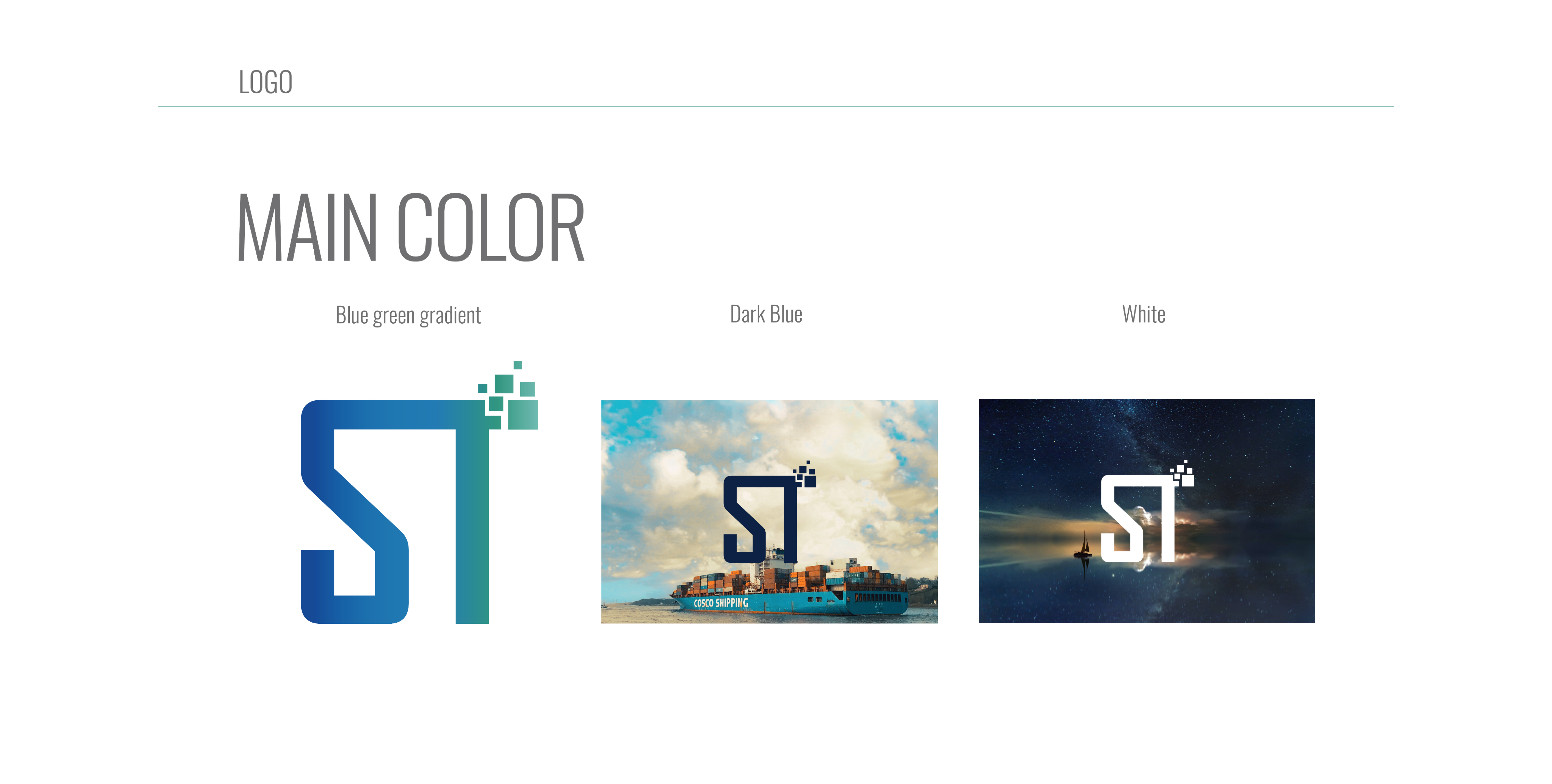
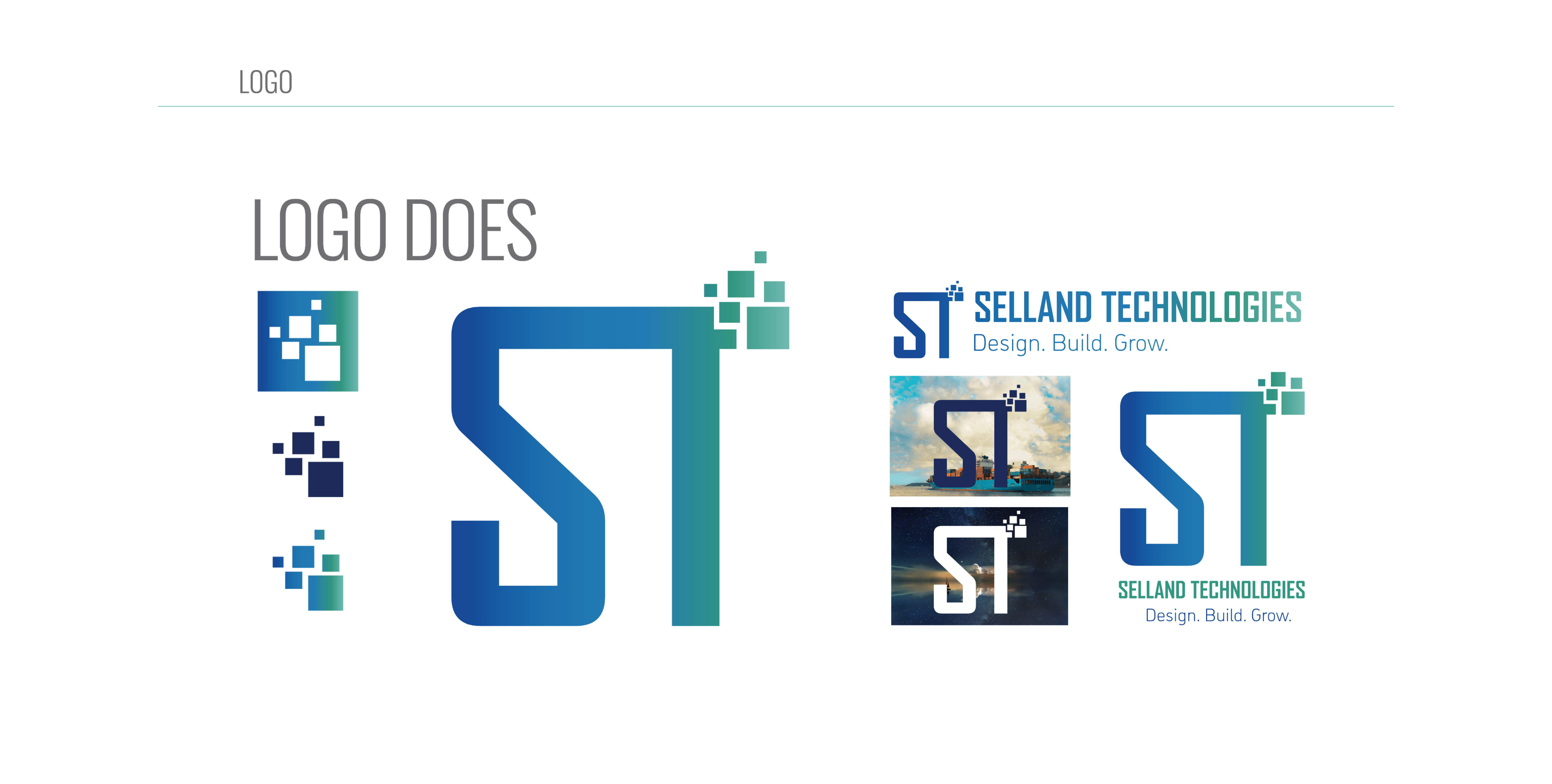
- Primary and secondary lockups, clear-space rules, minimum sizes and the permitted monochrome variants.
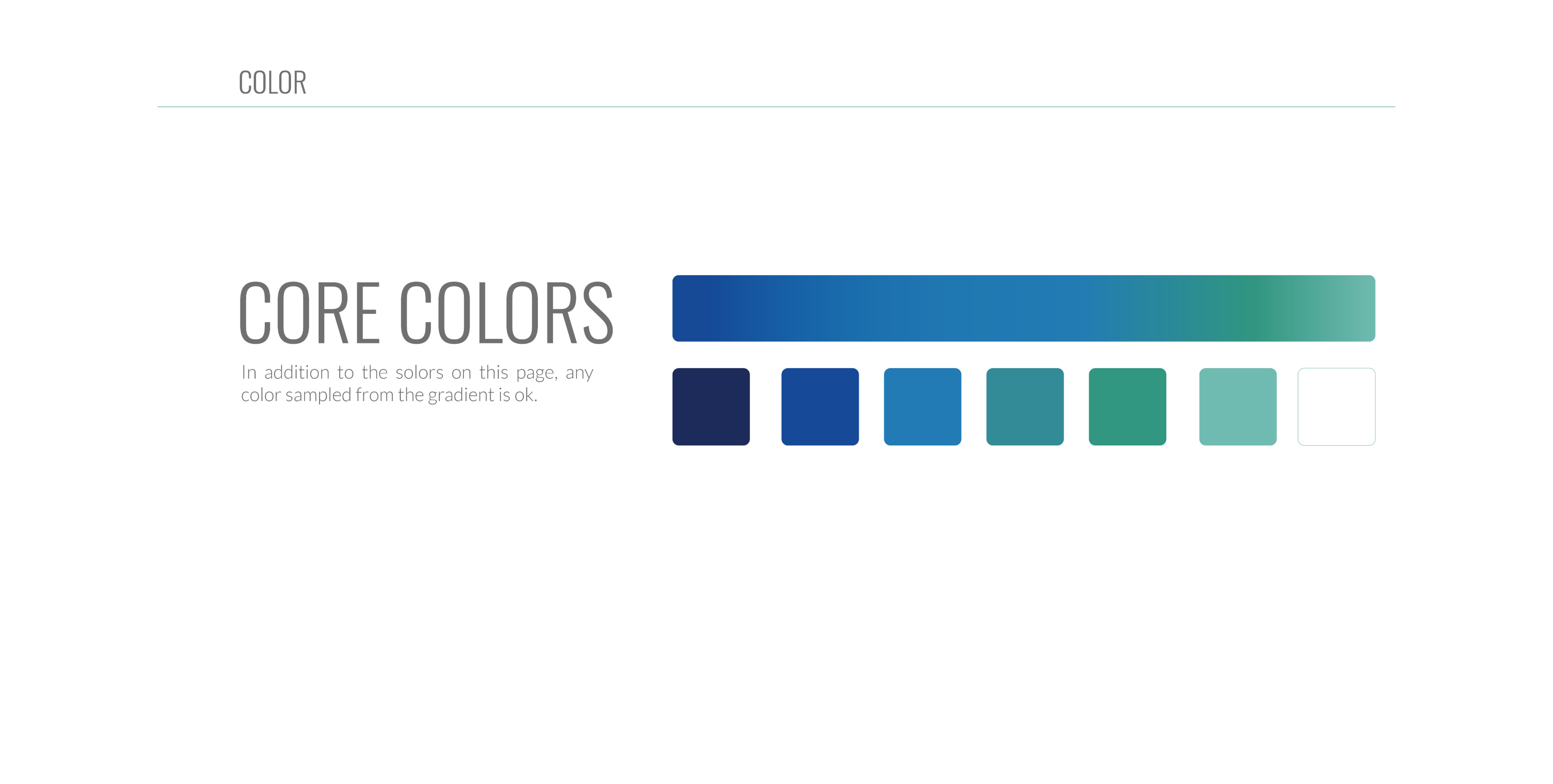
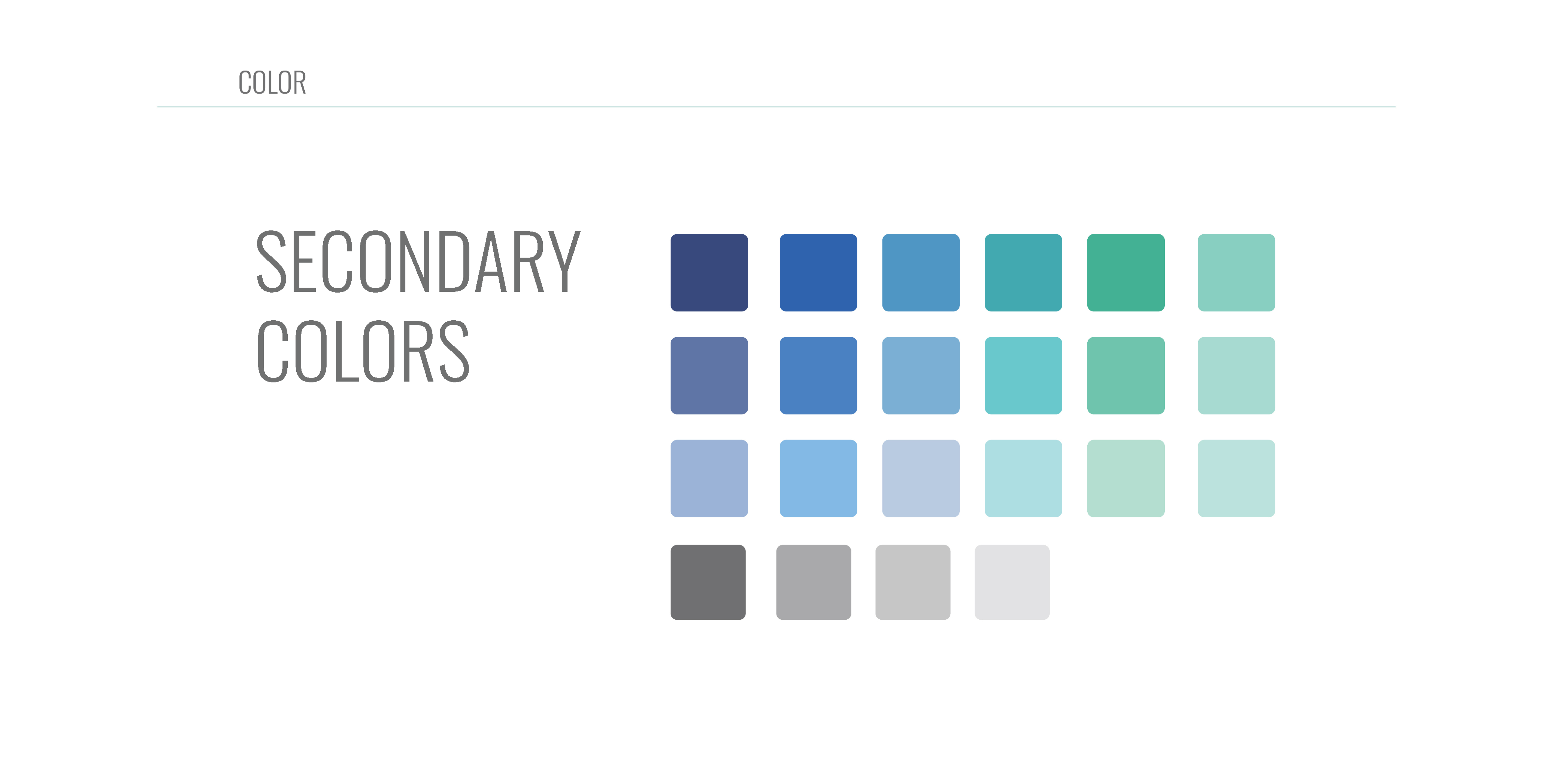
- COLOR
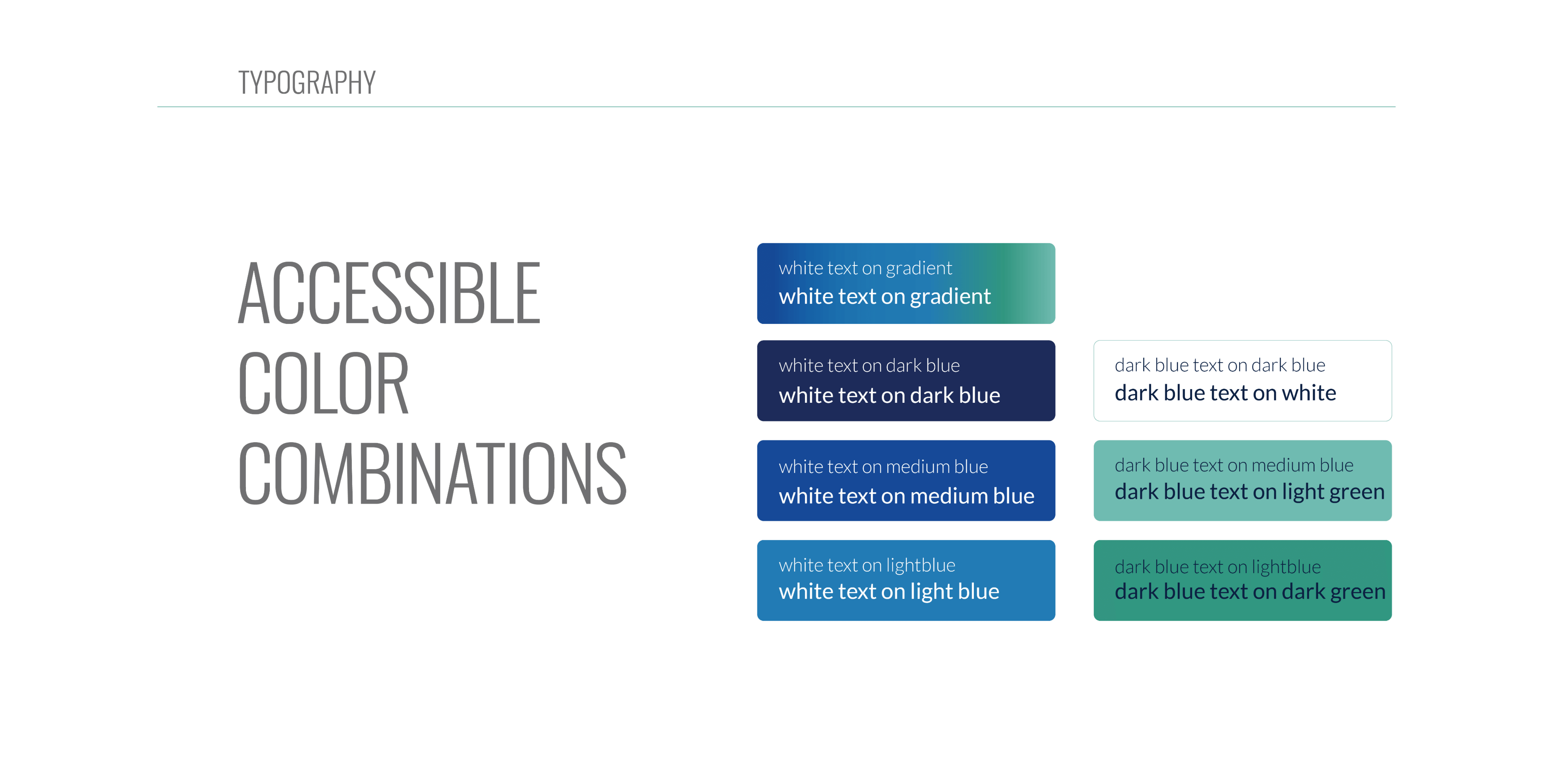
- A restrained core palette with supporting accents, defined for print and screen with contrast guidance.
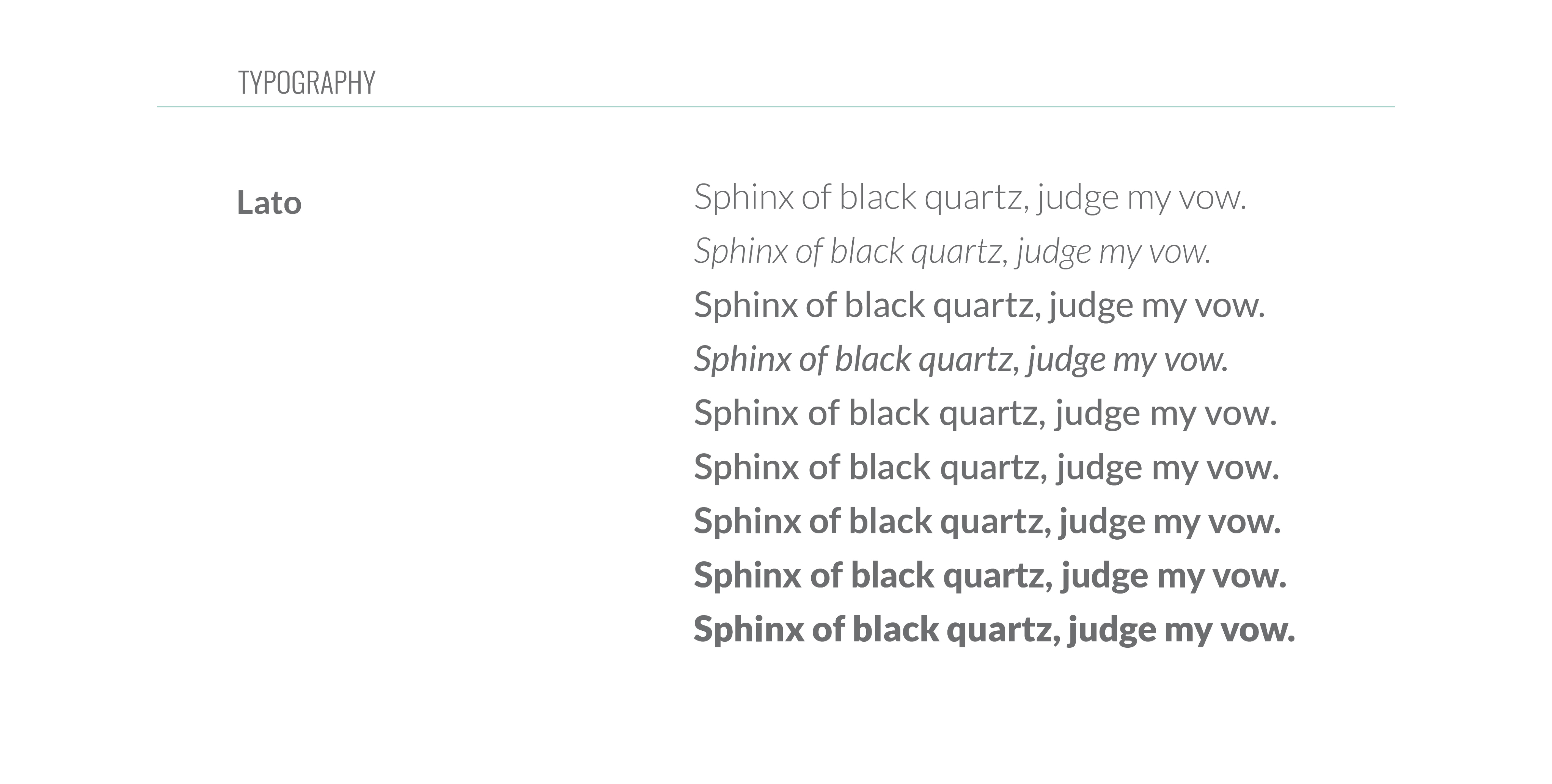
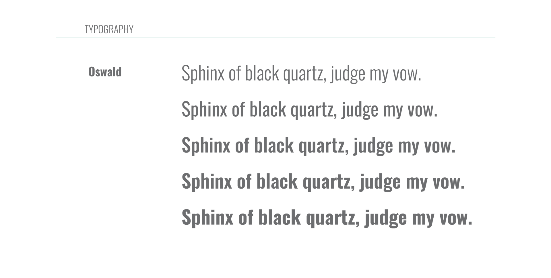
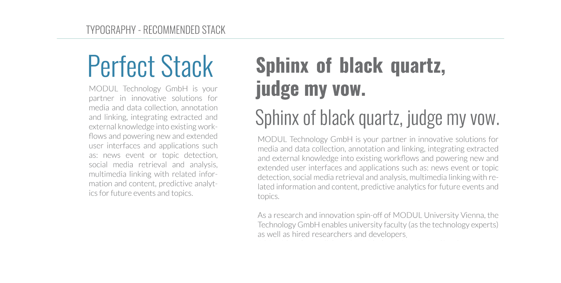
- TYPOGRAPHY
- A typographic scale for headlines, subheads and body copy, with rules for weight, case and measure.
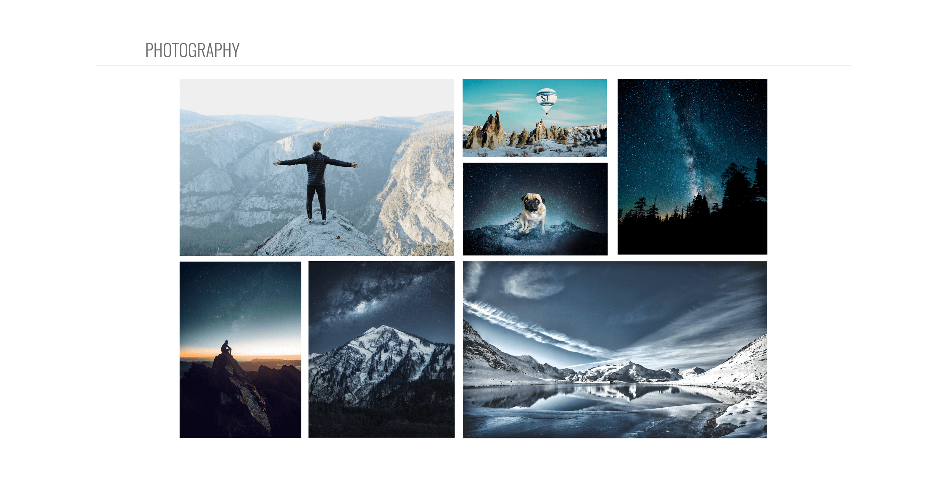
- PHOTOGRAPHY
- Art direction for subject, framing and treatment so imagery stays warm, technical and human.
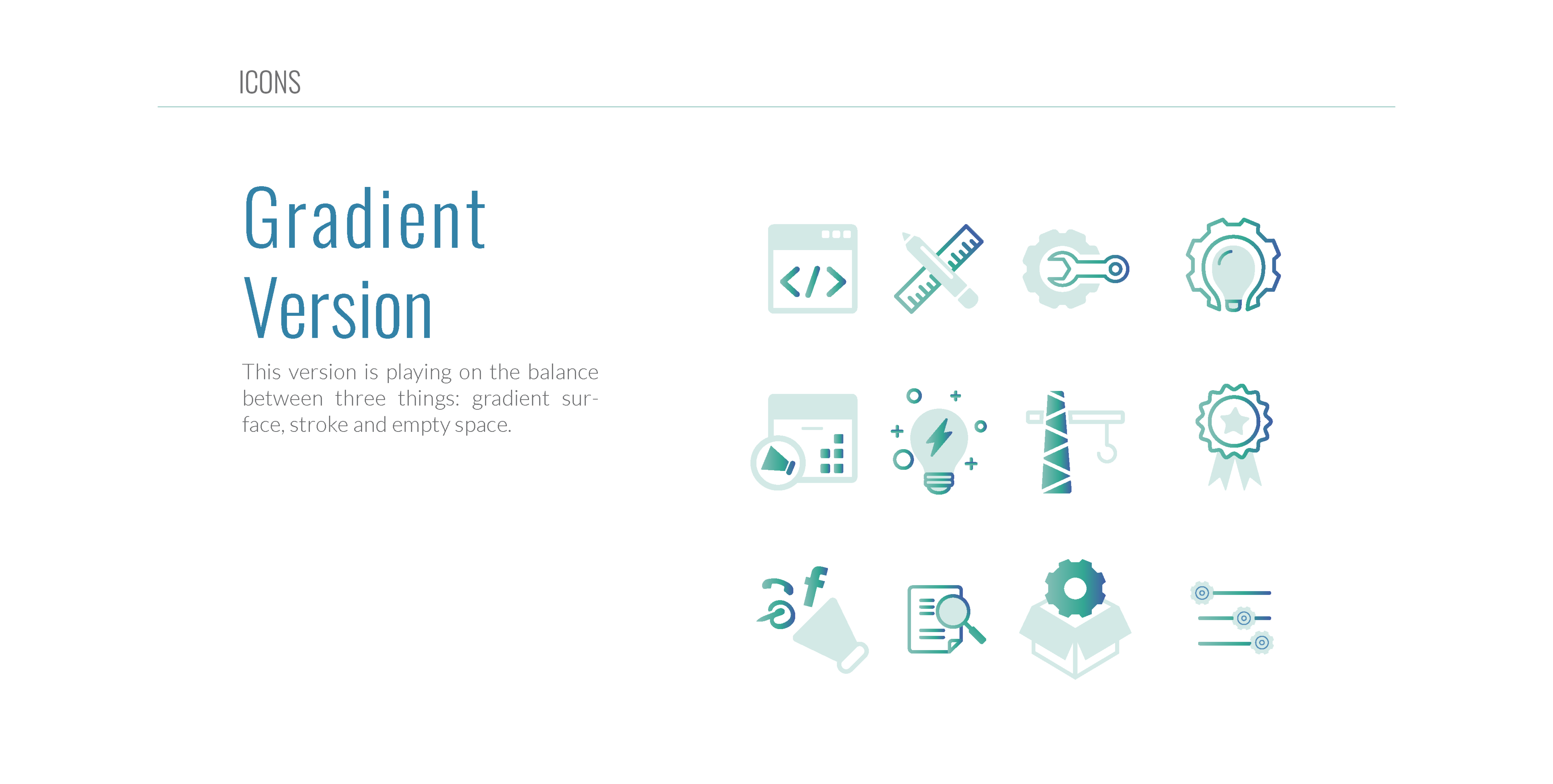
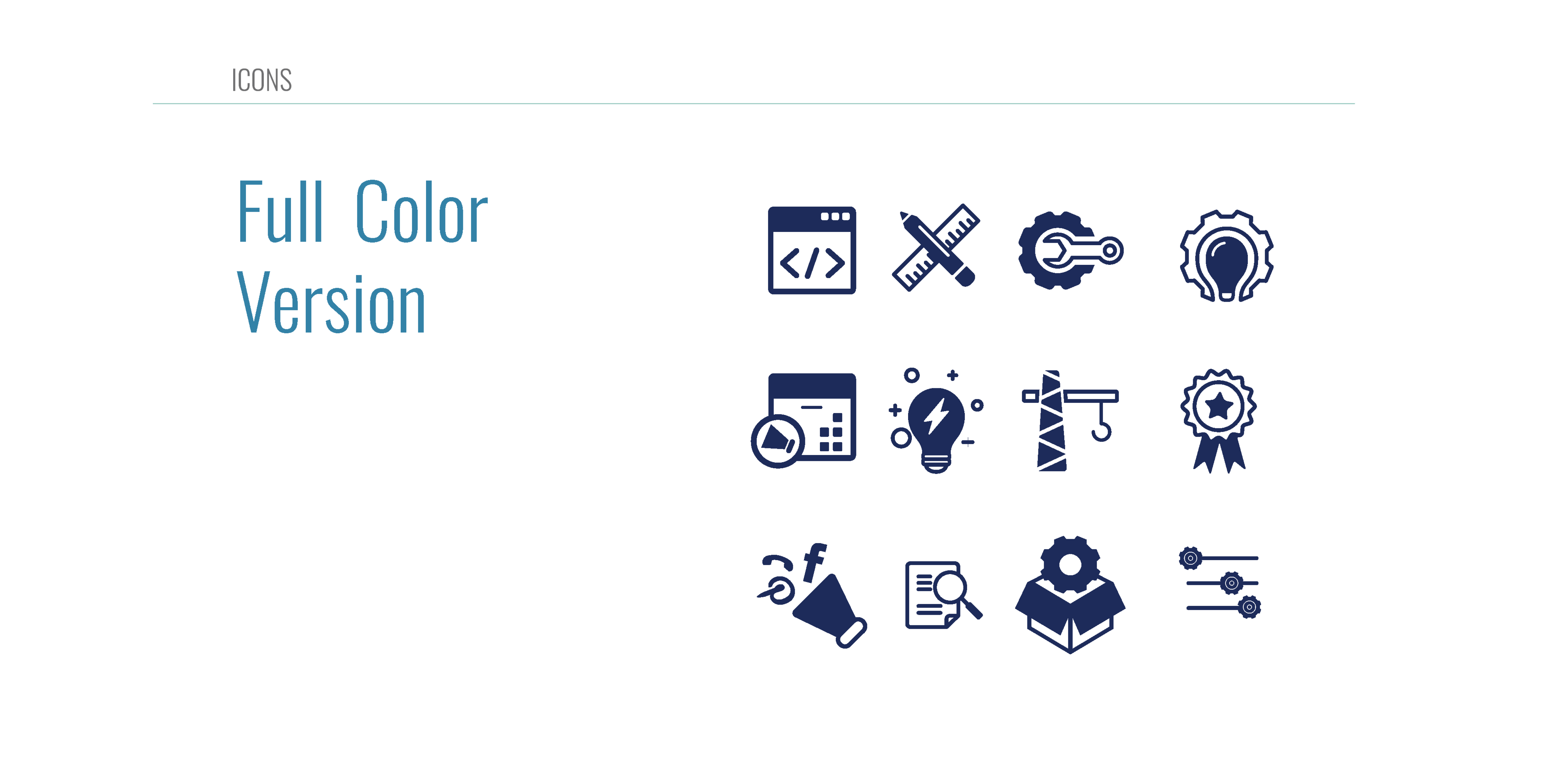
- ICONS
- A custom icon family built on a shared grid and stroke weight, extendable as the product range grows.
03
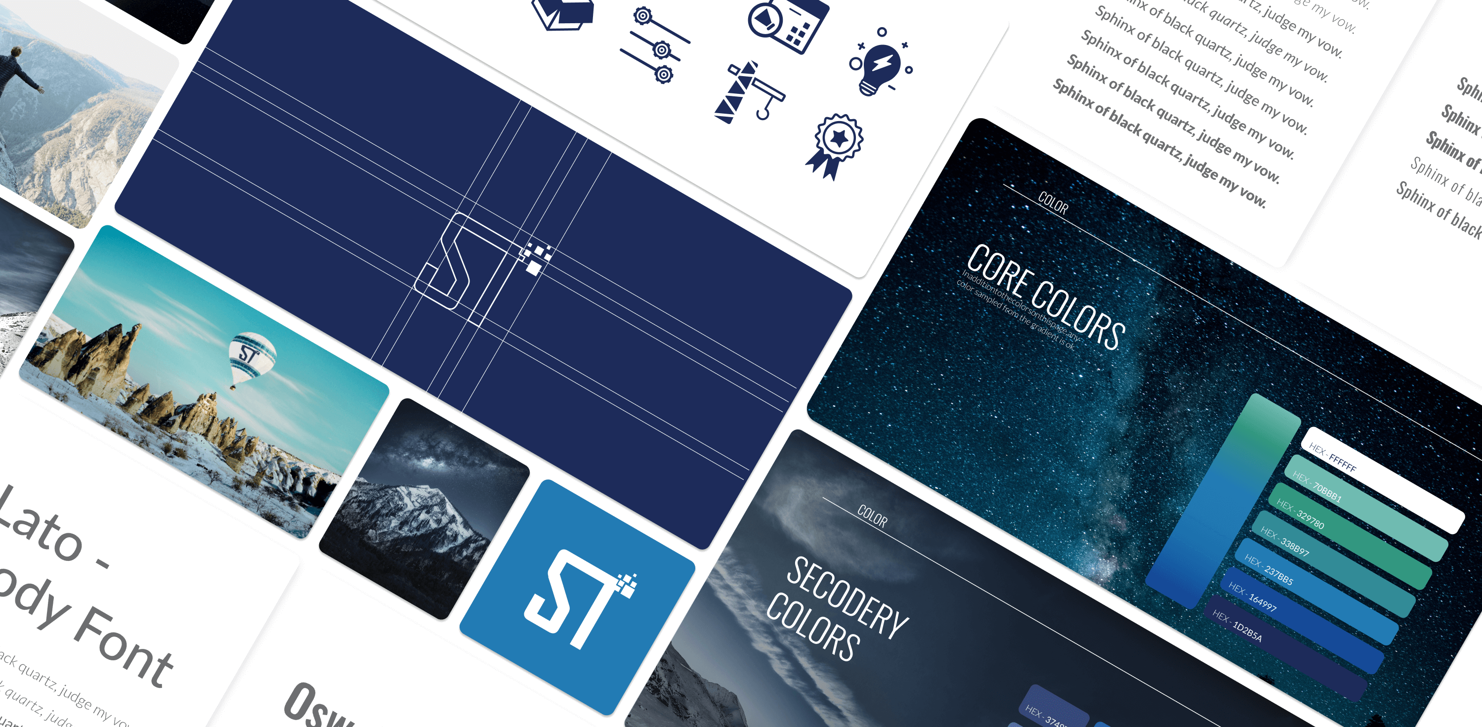
Brand book spreads